
ET Maps
Earth Resources Observation and Science (EROS) Center - Earthshots
With these water use maps, land managers and farmers can tell which crops use the most, or least, water at the field scale. From this, they can determine whether water could be used more efficiently. At the basin scale, large-area maps can be used to evaluate aquifer depletion and quantify groundwater pumping; or resolve water rights allocation disputes.
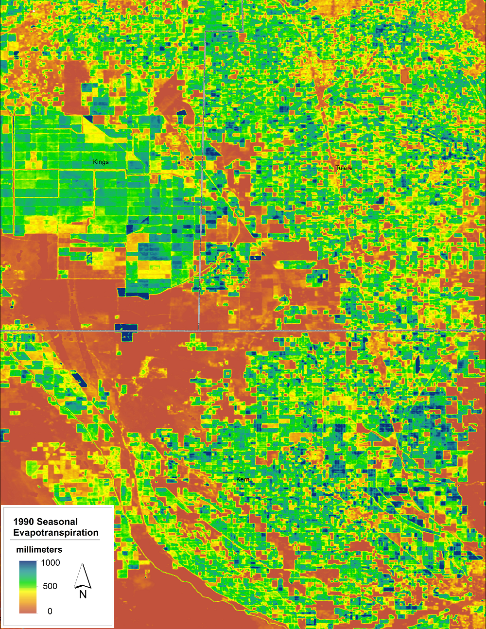
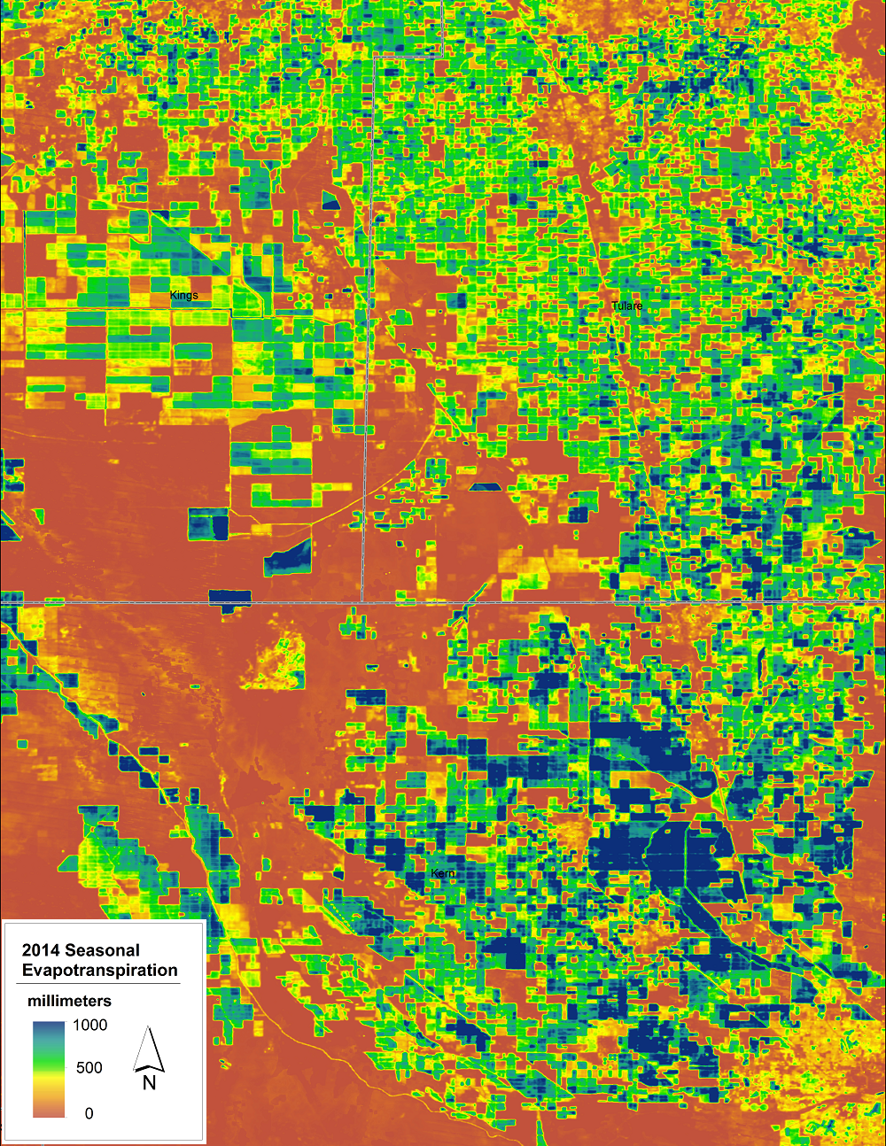
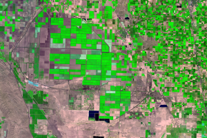
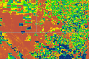
The accompanying pair of seasonal ET maps (May–September) shows crop water use in the San Joaquin Valley in 1990 and in 2014. The colors correspond to millimeters of water returned to the atmosphere through ET. Fields that are green and blue show the highest ET values. Relatively more water has been used on those irrigated fields. Orange hues are areas that have very little ET, such as sparsely vegetated desert.
Comparing the maps reveals changes in irrigation patterns during this period. Notice, for example, that water use intensified in many places (increase in blue areas) and some irrigated lands (green in 1990) transitioned out of agricultural production (reddish brown) by 2014.
These water use maps can show not just seasonal ET but water used in a single day, or even over the course of decades thanks to the extensive Landsat archive. View the .gif animation below that shows an annual ET map for every year from 1984 to 2014. This map series shows flooding events around Tulare Lake Bed in 1984 and 1997.
Accurate information on water availability and usage is necessary for planning sustainable use of water, particularly in an arid region like the southwestern United States. The study done for the San Joaquin Valley can become the basis for planning, monitoring, and assessing water use across the country. These maps can help farmers and land managers optimize and conserve water resources.

Imagery
Downloads
Related Content
San Joaquin Valley, California, USA
Changes in land use, climate, and population demographics are placing ...
Tulare Basin
In the southern portion of the San Joaquin Valley is the Tulare Lake B...
ET Maps
With these water use maps, land managers and farmers can tell which cr...